Nobody likes clicking around to navigate a website on their mobile phone. But mobile website traffic is going up and up; the majority of your traffic will come from phones, not desktops and laptops. So one of your biggest priorities before the start of the fourth business quarter should be making your mobile site friendlier for mobile users and cleaning up your website navigation. That means getting rid of the clicking where you can and improving the experience where you can’t.
How to get rid of clicking and tapping:
You can’t get rid of taps and clicks altogether. But if you make a conscious effort to reduce them and make navigation simpler, your visitors will enjoy your site more.
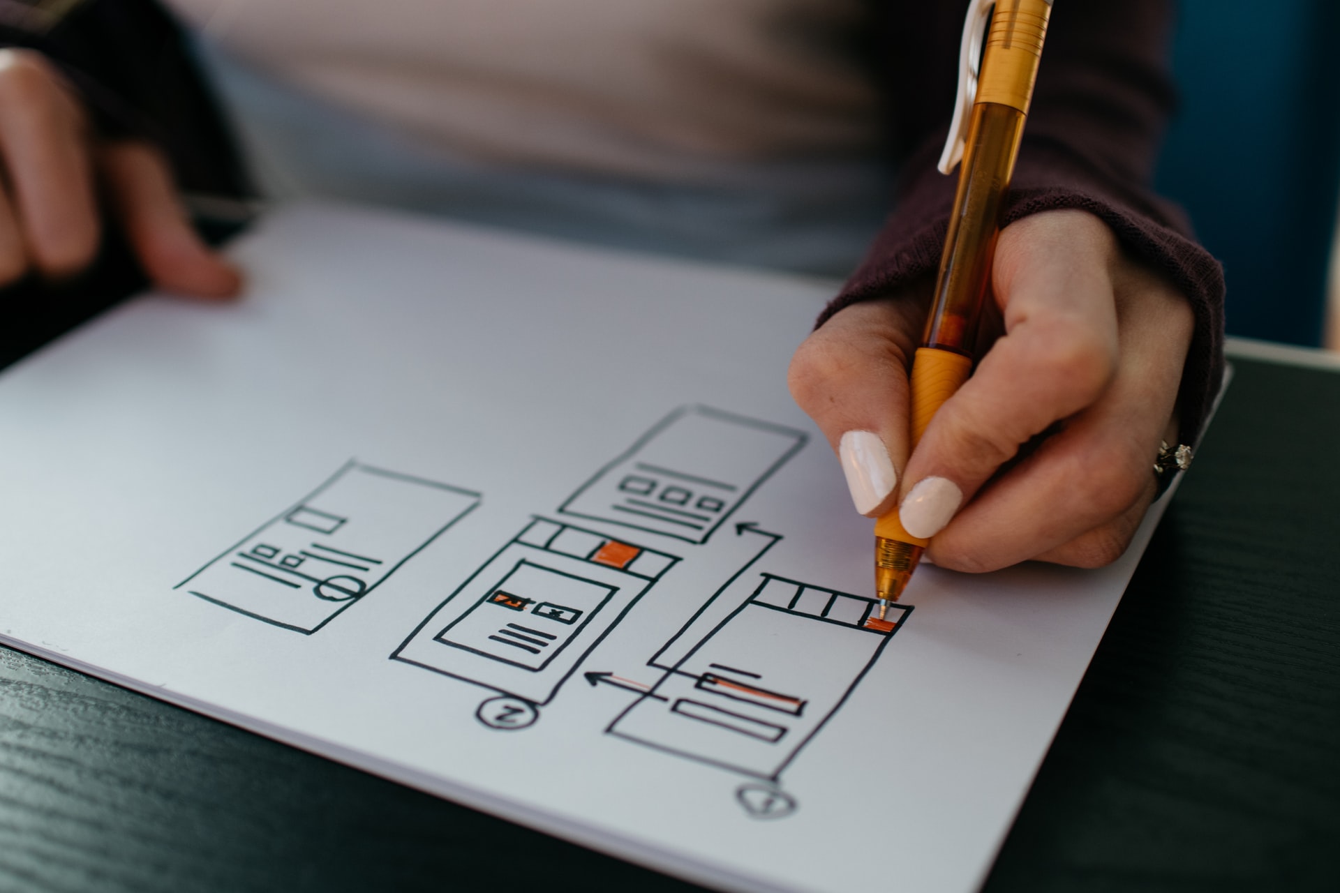
Have sections on your homepage instead of separate pages.
It’s easier to scroll than to tap back and forth. Make build your homepage with functional sections instead of relying on a navigation bar to send shoppers to their destinations. Every screen length should focus on a separate function. The first one, of course, introduces your business. The second one might go more in-depth into your products and services. Your third section will be a map or an appointment scheduler.
Know what your visitors are probably looking for.
As you’re setting up your sections, organize the hierarchy based on what your users will actually need. If you provide online services, you don’t need a map. If you have mobile services and you show up at a house or commercial location to do your job, prioritize that appointment setter so more visitors see it.
Optomize Your Website Navigation – Decrease the journey from start to finish.
Again, you can’t get rid of all the clicks and taps. But shrink down the number of times a customer has to click to go from your homepage to finish the checkout process. Features like secure password savers, straight to check-out buttons, and well-curated product recommendations will help.
How to make taps and clicks less annoying:
Decreasing the frequency of clicks isn’t enough. A good website also makes each click less of a headache and has clean website navigation. For example:
Hyperlink graphics, not words.
Sometimes you need to hyperlink words, especially in your business blog posts. But if you’re directing someone to your ecommerce platform or to a funnel page, use graphics like arrows and fun images. That makes the target for the tapping finger bigger and easier to hit. Visitors are also more likely to tap arrows intentionally when they want to move forward and avoid the graphics when they want to keep scrolling. Accidental clicks and redirects will quickly frustrate your mobile users, so avoid them with good design.
When words are hyperlinks, separate them and make them bigger.
If you have to have hyperlinked words on your homepage, make them as graphical as possible. Make them a different font, make them bigger, and make sure there aren’t any other links in immediate tapping range. If you have the space, go ahead and add an arrow, too, to make it clear that the word will redirect the visitor.
Focus on fast loading times.
Clicks and taps aren’t just annoying because they can be tricky to hit with precision. They’re also annoying when every misstep means delays and long loading times. If each page on your website takes a long time to load, your visitors are just going to leave. They’ll be even more annoyed if they didn’t want to go to a new page in the first place.
So make sure your website navigation is streamlined and your web hosting service maintains fast loading times. That way even accidental taps aren’t the end of the interaction. Navigation isn’t the only element of a great homepage. Read more of Delmarva Group, LLC’s tips here.


Recent Comments